Token Usage Dashboard
export const meta = { title: 'Token Usage Dashboard', description: 'Monitor AI token usage and cost trends across your property with the superadmin Token Usage Dashboard.', tags: ['reference'], };
The Token Usage Dashboard gives you a single place to monitor AI token consumption and spending across your property. Use it to understand usage patterns, spot unexpected increases, and investigate activity over time.
Use the Token Usage Dashboard for superadmin reporting across the property. If you need organization-level operational usage metrics such as workflow runs, steps executed, browser actions, cache hit rate, and usage trends, open Usage in Settings instead. See Usage.
01When to use the Token Usage Dashboard
Use the Token Usage Dashboard when you need a high-level view of how AI usage changes across your property. It helps you answer questions such as whether usage is trending up, which organizations, agents, or models drive usage, and whether current spend matches your expectations.
This dashboard is especially useful when you:
- Review overall AI usage for budgeting or operational planning
- Investigate sudden increases in token consumption or cost
- Compare recent usage against earlier periods
- Identify which organizations, agents, or models contribute the most usage
- Monitor adoption of AI-powered workflows and features over time
- Validate whether changes in workflows or prompts affect usage patterns
02Access and permissions
The Token Usage Dashboard is available to superadmins. If you do not have superadmin access, you cannot open or review this dashboard.
Open the dashboard from the administrative area of your property. If the dashboard is not visible, confirm that you are signed in with the correct account and that your role includes superadmin permissions.
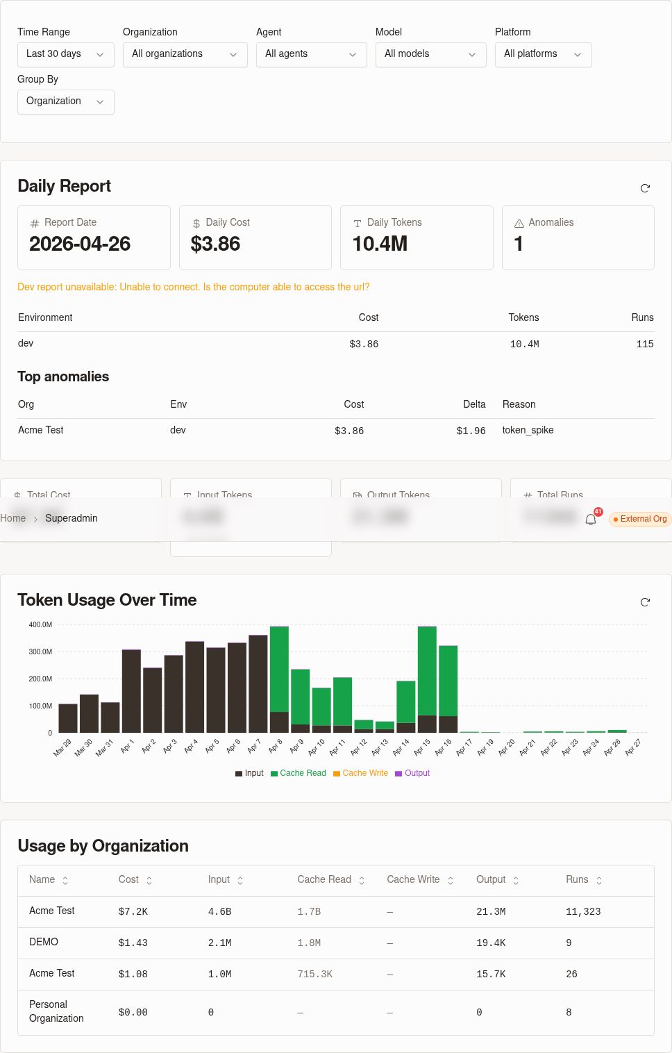
03Reading usage and cost data
Use the dashboard to read both token consumption and cost information together. Reviewing these views side by side helps you distinguish between normal activity growth and changes that have a larger spending impact.
Token usage metrics
Token usage metrics show how much AI activity occurs over a selected time period. Use these metrics to identify volume trends and correlate them with product changes, team activity, or workflow adoption.
Depending on the view, you may see summarized totals and trend information that help you answer questions like:
- How much AI usage occurred during the selected period
- Whether usage is increasing, decreasing, or remaining steady
- Which organizations, agents, or models account for the highest volume
- Which time ranges appear to have unusual spikes or drops
When you review token metrics, focus on changes in pattern rather than isolated numbers. A sustained increase often indicates broader adoption, while a sharp spike may point to a specific workflow, testing session, or short-lived burst of activity.
Cost views and trends
Cost views translate token usage into spending so you can monitor financial impact over time. Use these views to understand whether growing usage remains within expected limits.
Review cost trends alongside token trends to determine whether higher activity is producing a proportional increase in spend. This makes it easier to spot periods where costs rise faster than expected and deserve a closer look.
If you are tracking usage regularly, compare recent cost movement with previous periods to see whether the change is temporary or part of a larger trend.
The dashboard also includes a job-type cost breakdown. Use this view to see how total spend is distributed across major categories of AI work, such as workflows, ad hoc runs, and crawls. This helps you separate general cost growth from increases tied to a specific kind of activity.
04Filters
Use filters to narrow the dashboard to the activity you want to review. Start with a broad date range, then apply more specific filters to isolate where usage and cost come from.
The dashboard supports the following filter types:
| Filter | Use it to |
|---|---|
| Date range | Limit the dashboard to a specific reporting window so you can review recent activity, compare periods, or investigate a spike. |
| Organization | Focus on one organization or compare usage patterns across organizations. |
| Agent | Review token usage and cost for a specific agent when you need to understand adoption or investigate changes. |
| Model | Isolate usage by AI model to see which models drive token volume and spend. |
Apply filters before you review trends or breakdowns. This makes it easier to answer targeted questions such as which organization caused a recent increase or whether a model change affected cost.
When you review the job-type breakdown, use the same filters first. For example, filter to one organization or model, then compare job categories to see whether spend comes primarily from scheduled workflows, ad hoc execution, crawl activity, or another type of AI work.
05Charts and breakdowns
Use the dashboard charts to move from summary trends to detailed attribution. Start with the overall trend, then use breakdowns to identify which parts of your property contribute the most usage.
The dashboard includes the following views:
| View | What it shows |
|---|---|
| Trend charts | Token usage and cost over time for the selected filters, which helps you spot spikes, drops, and sustained changes. |
| Organization breakdown | Usage and cost grouped by organization so you can compare activity across tenants in your property. |
| Agent breakdown | Usage and cost grouped by agent so you can identify which agents drive the most activity. |
| Model breakdown | Usage and cost grouped by model so you can monitor model mix and cost impact. |
| Job type breakdown | Cost grouped by job category so you can see which kinds of work account for the most AI spend. |
When you investigate unexpected changes, start with the trend charts to find when the change began. Then review the organization, agent, model, and job type breakdowns to identify the most likely source.
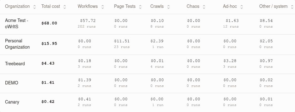
Job type breakdown categories
Use the Job type breakdown to understand how AI cost is distributed across different kinds of execution. The categories that appear depend on the activity in your selected date range and filters.
You may see categories such as:
| Job category | Meaning |
|---|---|
| Workflow | AI usage generated by workflow execution, including scheduled or triggered workflow runs. |
| Ad hoc run | AI usage generated by one-off or manually initiated runs outside a regular workflow schedule. |
| Crawl | AI usage generated during crawl-related processing. |
| Other | AI usage that does not fit one of the primary categories shown in the dashboard. |
| Unattributed | AI usage that cannot be mapped to a specific job category for the selected period. |
Expect the mix of categories to change as teams adopt new features or run different kinds of work. If a category does not appear, no cost was recorded for that category in the current view.
06Daily reporting
Use daily reporting when you need a day-by-day view of AI token usage and cost. This view helps you monitor ongoing changes, confirm whether a spike is isolated to a single day, and build a regular reporting rhythm for superadmin oversight.
Daily reporting is useful when you:
- Track usage and cost as part of a daily operations review
- Confirm whether a change persists across multiple days
- Compare weekday and weekend activity patterns
- Validate the effect of a rollout, prompt change, or workflow update
Review daily reporting together with the dashboard filters and breakdowns. For example, filter to one organization or model first, then use the daily view to see exactly when usage changed.
07Monitoring and investigation workflows
Use the dashboard as part of a regular monitoring routine:
- Open the Token Usage Dashboard and review the current period.
- Check for spikes, sustained increases, or sudden drops in token usage.
- Compare the cost trend with the usage trend to see whether spend changes match activity changes.
- Correlate changes with recent workflow edits, new AI-enabled processes, or broader team adoption.
- Recheck the dashboard after adjustments to confirm that usage returns to the expected range.
When you investigate unexpected changes, start with timeframe-based comparisons. Looking at multiple periods helps you separate one-time events from repeat patterns.
You can also use the dashboard after rolling out workflow updates, prompt changes, or new AI-assisted processes. This gives you a simple way to measure whether those changes increase usage efficiency or drive additional cost.
08Best practices
- Review the dashboard on a regular schedule so you can catch changes early.
- Compare token and cost trends together instead of looking at either metric in isolation.
- Investigate sharp spikes promptly to identify whether they reflect intentional rollout activity or unexpected behavior.
- Use timeframe comparisons to validate whether a change is temporary or persistent.
- Revisit the dashboard after shipping workflow updates or enabling new AI-heavy features.
- Restrict dashboard access to the appropriate superadmin users for administrative oversight.